velo

About the project
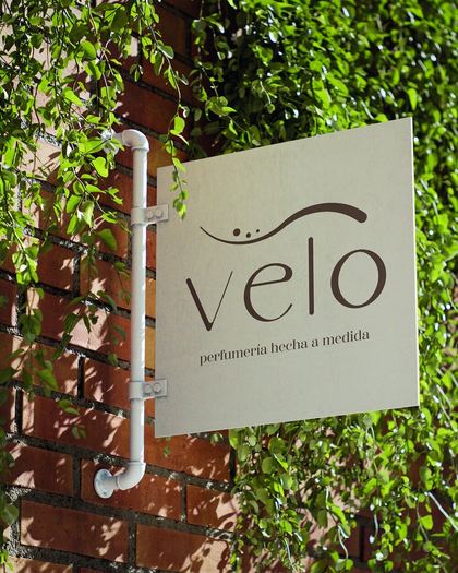
An author perfumery built on the idea of scent as an invisible extension of the skin, shaped by memory and personal history.
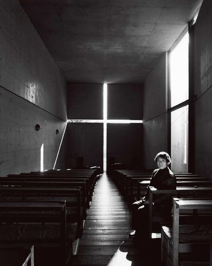
Drawing on the Shinto notion of the sacred in what is imperceptible, the identity treats perfume as a presence that is felt rather than seen. The name evokes a veil, a second skin. In the isotype, an asymmetric curve stands for the skin, its heavier end for each person’s history, and three dots for the scent leaving a trace. The palette comes from skin, leather, stone and wood.
Downloads


Campaign — Velo × Harvey Littleton
Reflection of unique stories: glass reflects its surroundings, and perfume reflects the personal history of the one who wears it.
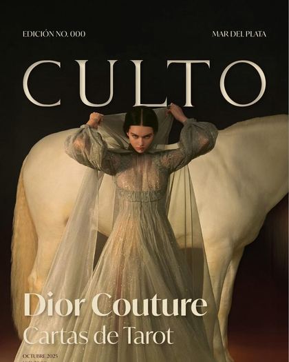
The campaign pairs Velo with glass artist Harvey Littleton, whose work treats each piece as unique and unrepeatable, just as each bottle stands for one person. Every poster sets two contrasting sculptures side by side, shot in close-up, so each reflection holds a different story. The three formats, magazine, street poster and roadside billboard, adjust the message to the time each one is seen.